Posts Tagged ‘visualization’

Devilish DataViz – Six Data Analysis Mistakes To Avoid

June 21, 2014 in Uncategorized | Comments (0)

Tags: , ,

A thought bubble persisting in my mind as the (tech marketing) fads of the moment celebrate how easy it is to deal with large volumes of disparate data, is how not thinking carefully about the inputs and methodologies can lead to terrible, terrible outcomes.

Simply presenting a compelling story with pretty graphics is a sure fire winner for mainstream, and often business management, consumption. I don’t dare to delve into the arguments that erupted (and for some, continue) over climate change which, based on the zillions of data points, lead us to try boil it down to binaries of, is it real or not, man-made or not, or the even more difficult, when.

I’ll take a different, and perhaps equally contentious, but certainly fun route of talking about porn and politics!

What? How do these go together, you ask?

Building on my previous article which looked at spurious correlations, I came across a great article that looks in detail how an infographic, well, just a chart really, makes six big decisions affecting the outcome that the casual viewer will not realise without digging deeper. We’re back at statistics being used to argue any point desired.

The folks at Source have written a great, in depth, article about the “mistakes” (their word) in a data presented by PornHub’s data scientists relating online pornography consumption by America’s “red” and “blue” states. That is, a predominance of voting for the Republican or Democratic parties.

PornHub - Red vs Blue

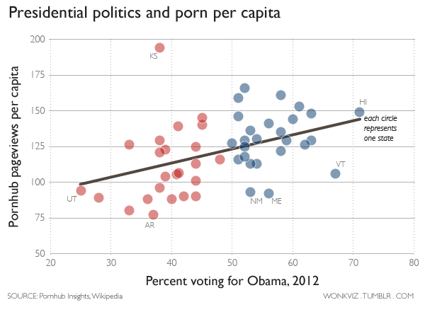
By Christopher Ingraham

I’m sure the chart would raise lots of eyebrows, but Jacob Harris writes on Source about six key errors:

  • Sloppy use of proxies – or bad sampling
  • Dichotomizing – turning something complex into just two categories
  • Correlation does not equal causation – ’nuff said
  • Ecological inference – sorta like stereotyping
  • Geocoding – specifically, badly applied IP geocoding
  • Data naivete – it’s not just numbers, there’s real meaning there to understand

Yes, data visualization can be devilish, but like anything, the devil is in the detail. You can’t blindly trust an infographic or chart. Validate the sources and think about what’s really going on.

I leave you with a link to this Dilbert comic.


Beware the Malicious (or Ignorant) Data Scientist

June 12, 2014 in Uncategorized | Comments (0)

Tags: , ,

Oh, people can come up with statistics to prove anything. 14% of people know that.” – Homer Simpson

98% of all statistics are made up.” – A common statistics joke.

There are three kinds of lies: lies, damned lies, and statistics.” – A phrase popularised by Mark Twain, among others.

Three in ten Americans (29%) report that they are not good at math.” – Olgivy PR run survey for Change the Equation.

Fifty-five percent of Americans think that they are smarter than the average American.” – Yougov survey.

Bad Statistics

Three out of the above five statements/quotes are about or by Americans. No, I’m not picking on Americans, that’s just what I was able to find quickly using an American company’s search engine.

Statistics is a foundational component to data science, so, as much as many may fear mathematics, especially statistics, practitioners and users of modern business intelligence systems, data visualisation tools and infographics need to be careful of the power they wield and not become the profession derided by mass media through misuse.

The claims that some software vendors make, especially in the big data arena, about how easy it is to mash data together and derive useful insights bewilders me. Sure, I agree that certain things can be made easier, less tedious, faster and prettier, but that doesn’t detract from the need to have a strong knowledge of the underlying data, how that data was acquired, and the systems, processes, events or activities the data represents.

I would generalise that data scientists are not malicious or ignorant. At least not willingly or knowingly. But the great work a data scientist may have produced can be taken out of context and misused.

On the other hand, data scientists can have a bit of fun. Check out some of the work done at Spurious Correlations.


Causality and the Link Between Twerking and Syria

October 10, 2013 in Uncategorized | Comments (0)

Tags: ,

Gotta love data analysis, but most of all, how one can magically link totally unrelated topics. Does that sound like the promises made by big data vendors? Throw a lot of data in and magically gain insights not thought of previously?

If you were lucky, you may have learnt about causality in science class at school. If not, here’s what Wikipedia has to say about causality.  More importantly, you may know that correlation does not imply causation. Wikipedia explains it, but you might enjoy XKCD’s version more.

Well, perhaps it’s not all that bad, but this interesting article looking at tweet volumes in the US for tweets including the term twerking or Syria.

The Twerkyria Index by County, August 2013 - Floatingsheep.org

The Twerkyria Index by County, August 2013 – Floatingsheep.org

What seems to be a bit of fun, can point to useful social research. Useful for what? Well, I’ll leave that to others. What would be interesting, maybe not really useful, is tweet volumes over the same period for twerking and Syria by country.

Bringing this all back to business….I wonder if there’s any research done using big data, on the hype that is big data, maybe done by tweet analysis on the phrase, “big data”? Is it correlated to major product launches, industry trade shows, or mentions on mainstream media?

Interested to see what you have to say in the comments…


40 Maps That Will Help You Make Sense of the World

October 3, 2013 in Uncategorized | Comments (0)

Tags: , ,

Mapping is one of the most common forms of data visualisation. Some of these images have small data sets behind them (like the map of writing systems), others have massive amounts (like the map of all the rivers in the contiguous United States).

Average Age of First Sexual Intercourse by Country, ChartsBin.com
Average Age at first sex by Country
Most of these maps make information accessible, and for some, also help contextualize scale.

The thing that is missing in each of these, though perhaps they are listed on their source websites, is information or metadata about the data sources. In today’s digital media and web era where images and text can be easily separated, it is important that the image contains relevant and complete information if it is to be taken seriously, especially when images can be taken out of their original context.

Metadata such as data sources, when the image was created, by whom, and any major assumptions should be part of the image, even in small text if necessary, if the image is to be used in anything more than a meme.

Check out the 40 maps here:

http://twistedsifter.com/2013/08/maps-that-will-help-you-make-sense-of-the-world/


The Color of Fire: How Palette Choice Impacts Maps of Yosemite’s Rim Fire

September 16, 2013 in Uncategorized | Comments (0)

Tags: ,

When preparing visualisations of data (for business or otherwise), think about what it is you are trying to convey and how easy it is (or not) to determine that information at a glance.


Compare this image depicting the progress of the massive Rimfire in California (source Wired):

Rimfire Progress Palette 1

Rimfire Progress Palette 1

and this (source Wired):

Rimfire Progress Palette 2

Rimfire Progress Palette 2

One uses a rather random colour scale for each of the days’  fire progress, where as the second one makes a colour progression reflecting the fire’s progression.

Read more about how this was prepared here:

http://www.wired.com/wiredscience/2013/09/rim-fire-map-color-scale/